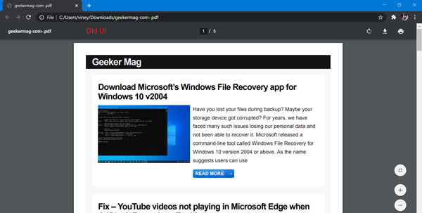
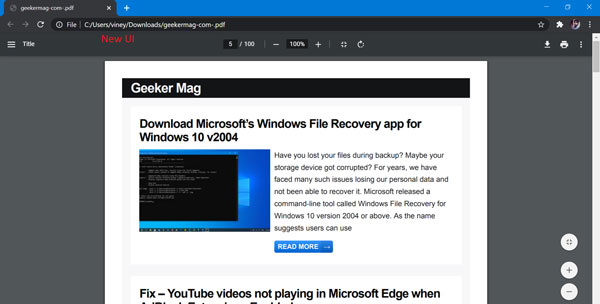
Chrome PDF Viewer Old UI Look below, in the older version on the taskbar only the PDF name at top-left, page number details in the top-center, refresh button, download button followed by a print button in the top-right. Fit to the width and Fit to screen along with zoom in/out were on the bottom right placed vertically. Chrome PDF Viewer New UI In the newer version, Google has re-arranged all these buttons in one place I.e the taskbar. Starting with the menu button and PDF title on the top-left, page number details, zoom in/out, fit to width and fit to screen, and refresh button in the top center, finally, download button, print button, and ‘more options’ on the top-right. The PDF Viewer’s new UI assembled all the tools and options in the toolbar. The new PDF viewer is available from Google chrome version 83.0.4103.116 that was released on 23/06/2000. If you liked this interface, let us show you how to enable this new interface on your Google chrome.
Enable New UI for Chrome PDF Viewer
Launch Chrome browser and then visit chrome://flags/#pdf-viewer-update flag address. Using the PDF Viewer Update drop-down change the settings from Default to Enabled. Relaunch Chrome browser to apply the changes. After doing this, if you open a PDF file, you will find a text on top stating, ‘New PDF Viewer toolbar will appear over here’. Not just Google chrome, even Microsoft has been working on a new Microsoft Edge PDF Reader that would enable some of the features like table of content, highlighter option, adding notes (context), digital signatures, protected PDF files, etc… Mozilla is coping with the race by constantly updating PDF.js. You can now set Firefox as a PDF as a default PDF Viewer. Thanks, Techdows for the news!


